

.png)
.png)

Hello! I'm a Designer who's passionate about crafting visually stunning and user-friendly interfaces.
My wide range of skills enables me to think creatively outside the box, develop unique concepts, and design projects that are not only functional but also beautiful.


Designing this app was a fun adventure. The goal was to create a meet up app where users could make meaningful new connections based on different data points. By using new brand guidelines, I was able to create a simple yet modern UI base project requirement.


Generally, I prefer to map out the interactions, as you can see below. This approach enables me to quickly refine the flow before diving into creating UI visuals in Figma.


Once users complete their initial profile, their journey unfolds as they step into their dashboard. Here, they can smoothly navigate through Meets events and catch up on highlights posted by fellow members. It's like their own personalized space for connection and discovery!


This was a project where I definitely had to navigate many moving part but I learned a lot; I collaborated with some awesome folks!
I was task to enhance the UI Design within the authenticated environment for the home, transactions, statements pages and new features such the pre-autorized debit form.
Throughout this specific project, I had the opportunity to collaborate closely with the UX Designer from the very start of our brainstorming sessions. Together, we identified multiple areas that required improvement and came up with innovative ideas for new features. Additionally, I conducted a comprehensive analysis of our main competitors in the market and examined current trends within the banking sector.

The requirements from the business, legal, and development teams were definitely a challenge, as some of the goals interfered with each other. However, understanding the underling motivation of each team helped tremendously in challenging them to ultimately creating the best user-centric interface.

Shown below are some of the competitors we looked at.

I was tasked with improving the flow and interface for downloading statements. We consulted with the production team to make sure there were no conflicting components.
I personalized the form options to adapt seamlessly to the data at hand, adjusting based on what users chose. This resulted when the spreadsheet option was made exclusive to the current year while the PDF option remained accessible for previous years.
It's all about making things convenient for the user!

I also made sure all designs were optimized for tablet and mobile devices.


I joined this project from the very beginning and had the great opportunity to partner closely with our software engineering team every step of the way. I teamed up with the project lead to conduct user research, which helped us pinpoint the right features to build. I then focused on creating a component-based design system to make the handoff to developers incredibly smooth. To top it off, I developed a full branding identity that helped the product find its unique voice and resonate within the industry.
Court+ provides the foundation for a thriving pickleball club by seamlessly integrating court bookings, event management, and league or tournament organization into a single platform. It also offers tools for coaching schedules, member communication, and club marketing, fostering a connected and engaged community. This all-in-one solution handles the complex logistics so organizers can focus on building a vibrant pickleball culture.
.png)
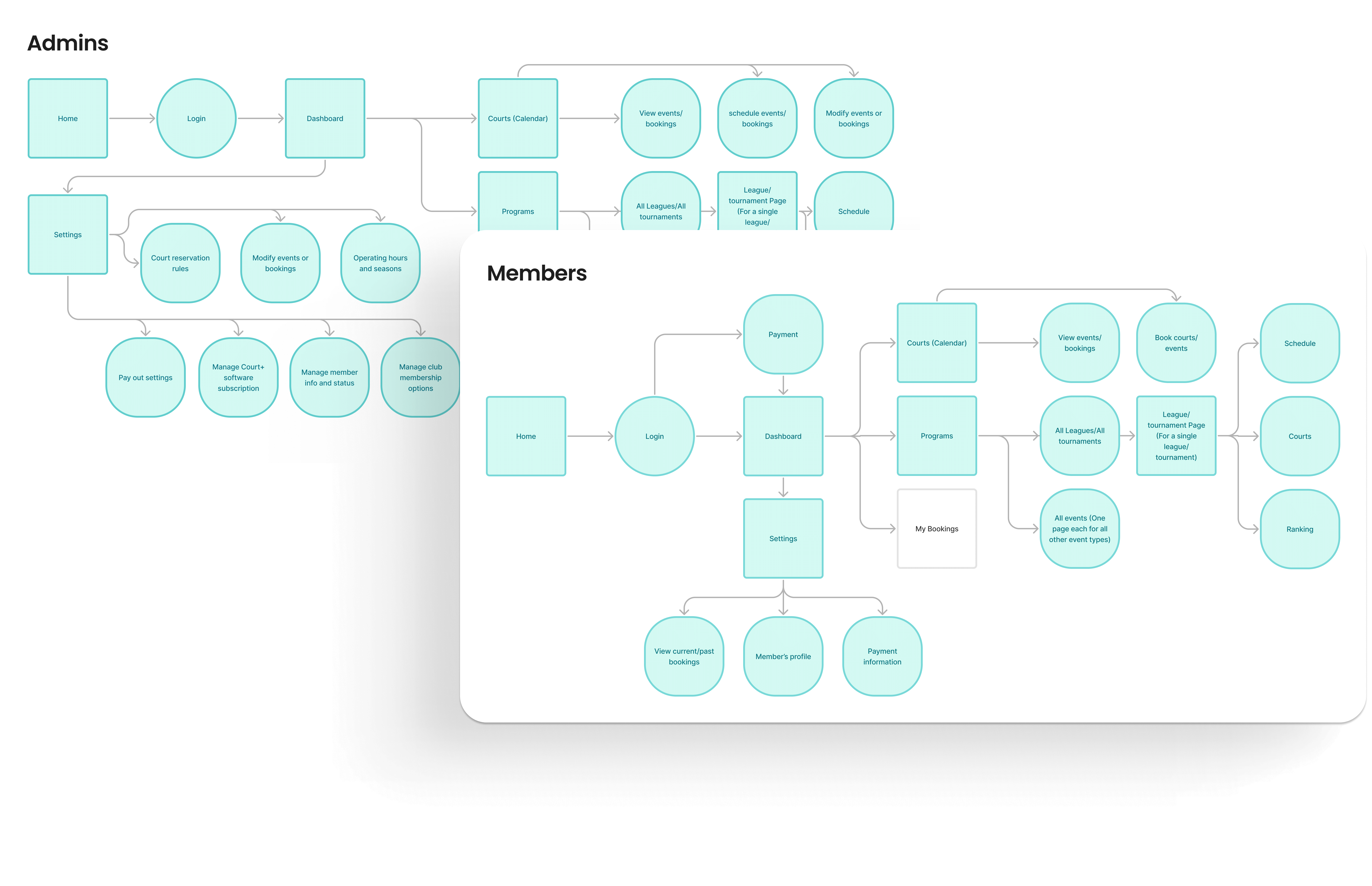
After mapping out the user flows in collaboration with the founder, I got to work bringing them to life—starting with mobile wireframes to make sure the core experience felt right first.


Designed for two primary users—Members and Admins—the platform provides separate, role-specific experiences. View some screens for each below.


.png)
